Reading: Visualization of the model fitting process
As part of the course Stat 503 I am taking this semester, I will be posting a series of responses to assigned course readings. Mostly these will be my rambling thoughts as I skim papers.
This week we are reading a paper by Hadley Wickham, Dianne Cook, and Heike Hofmann entitled “Visualizing Statistical Models: Removing the Blindfold” which was submitted to the Annals of Applied Statistics. This paper presents multiple ways that visualization can be useful throughout the model fitting process, rather than solely after the models have been fit and a “best” model has been selected. This paper has been my favorite reading assignment thus far in the semester; I feel as though I’d been thinking of some of these concepts without knowing how to put words to them properly.
Strategies
There are three main strategies presented in the paper to enhance model fitting through the use of visualization and graphics:
- Display the model in the data space
- Look at all members in the collection
- Understand the process of model fitting
These three ideas on their own can be very powerful, but together I imagine the improvement to the model fitting would be more than the sum of the parts. To get an idea for all three of these suggestions, I will run through a case study of fitting linear models to the mtcars dataset.
Model in the data space
A common way to diagnose the fit of a model is to display the data in the model space. For example, with linear regression we often look at plots of residuals versus fitted values to assess the assumptions of a linear model. This maps each observation (data) to a point in two dimensions that are summaries from the model (in the model space). The authors suggest flipping this paradigm and mapping the model in the data space instead. One way to accomplish this for a predictive model with continuous response is to visualize the response surface over a grid of predictors.
For a (very simple) regression example of fitting a linear model to the mtcars dataset, predicting miles per gallon (mpg) with engine displacement (disp) and horespower (hp), we can fit the model and then view the resulting prediction surface (a plane) in the dataspace with the data overlaid in red.
library(plyr)
library(ggplot2)
library(dplyr)
library(tidyr)
library(scatterplot3d)

m0 <- lm(mpg ~ disp + hp, data = mtcars)
grid <- data.frame(disp = seq(min(mtcars$disp), max(mtcars$disp), len = 50),
           hp = seq(min(mtcars$hp), max(mtcars$hp), len = 50))

grid$pred <- predict(m0, newdata = grid)
grid <- grid[order(grid$disp,grid$hp),]

s3d <- scatterplot3d(mtcars[,c("disp", "hp", "mpg")], pch=20, color="red", angle=30)
s3d$plane3d(m0)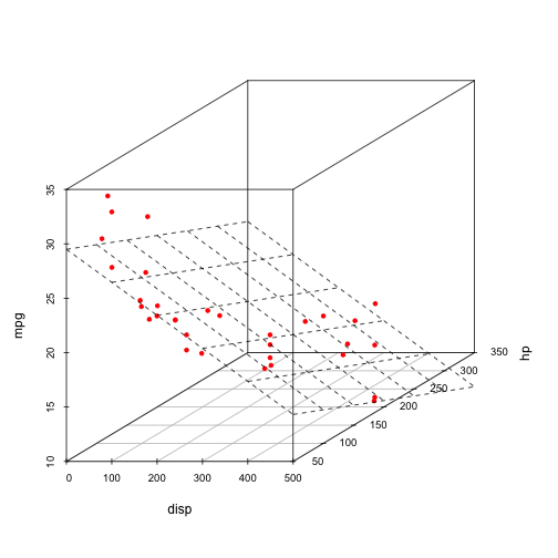
This is commonly done for OLS regression where we have 2 dimensions. Once we get beyond 2 predictors (3 dimensions), this visualization requires much more creativity and some special tools (like GGobi).
A look at the members
In many modeling activities, some models are fit within the same family of models (think linear models with a main effect for example) and then a “best” combination of variables is chosen through some criteria (AIC, BIC, etc.). However, the only model that gets explored in depth is this best model. The less optimal models are thrown away in the selection process. The authors argue that by visualizing multiple models in the selection process can give “more insight into the data and the relative merits of different models”. To quote John Tukey,
The greatest value of a picture is when it forces us to notice what we never expected to see.
This is an important concept that can be applied to the model selection process, and is what the authors suggest when they say “look at members in a collection”. We can explore multiple models and hopefully find out something we never expected about the data and benefits of different models.
To get an idea for how this works, I will fit everypossible combination of predictors in the mtcars example for models with at least two explanatory variables. We can then look at the values for the stimates of the coefficients associated with each variable in a parallel coordinates plot. Note that a value of zero means that variable wasn’t included in the model. We can aso plot some (standardized) model fit diagnostics for each model and look for a relationship between complexity and fit for our many models.
formulas <- data.frame(n_param = 2:(ncol(mtcars) - 1)) %>%
  mutate(num_comb = choose(ncol(mtcars) - 1, n_param)) %>%
  group_by(n_param) %>%
  do(forms = sapply(paste0("mpg ~ ", apply(combn(names(mtcars)[-1], .$n_param), 2, paste, collapse = " + ")), formula))

res <- list()
for(i in 1:nrow(formulas)) {
  tmp <- data.frame()
  for(j in formulas[i,"forms"][[1]][[1]]) {
    m <- lm(j, data = mtcars)
    coefs <- data.frame(m$coef)
    names(coefs) <- "value"
    coefs$pred <- rownames(coefs)
    rownames(coefs) <- NULL
    coefs$formula <- paste(all.vars(j), collapse=",")
    coefs$aic <- AIC(m)
    coefs$bic <- BIC(m)
    coefs$r.square <- summary(m)$r.squared
    coefs$n_param <- formulas[i, "n_param"][[1]] + 1
    tmp <- rbind(tmp, coefs)
  }
  res[[i]] <- tmp
}

res <- ldply(res)
res %>%
  spread(key = pred, value = value, fill = 0) %>%
  gather(pred, estimate, -c(formula, aic, bic, r.square, n_param)) -> estimates

estimates %>%
  filter(pred != "(Intercept)") %>%
  ggplot() +
  geom_line(aes(pred, estimate, group = formula))

estimates %>%
  select(n_param, aic, bic, r.square) %>%
  distinct() %>%
  select(-n_param) %>%
  scale() %>%
  cbind(estimates %>% select(n_param, aic) %>% distinct() %>% select(n_param)) %>%
  gather(measure, value, -n_param) %>%
  ggplot() +
  geom_point(aes(n_param, value)) + facet_wrap(~measure) +
  ylab("Standardized value") + xlab("Number of Parameters")

It would be interesting to explore these plots with interactive linked brushing, as was done in the paper, however there are still interesting things to note about the models. First, number of carburetors (carb), number of cylinders in the engine (cyl), and weight (wt) always negatively affect fuel efficiency when included in the model. Secondly it appears the number of forward gears (gear), 1/4 mile time (qsec) and V/S (vs) can either negatively or positively affect fuel efficiency. It would be interesting to investigate which models these are to explore collinearity in the model.
Understanding the process
By understanding how a model is fit, and by that I mean the algorithm that fits the model, we can more fully understand how specific data affect the resulting model. This can often be accomplished by visualizing the iterations of a model fitting algorithm to view each step in the process. For example, using the Newton-Raphson method, we could see the steps taken to arrive at a maximum in maximum likelihood fitting for a specific model.
Conclusion
To sum of this approach, why only look at one model when you can look at hundreds? By visualizing multiple models we can find interesting things about the data that we may not have known from just looking at one model. Additionally, viewing the model in the data space can provide additional insight as to why a certain model is fit. Finally, understanding the model that is being fit is always a good idea (let’s avoid the dreaded black box!). Visualization of models can help with all three of these ideas.
blog comments powered by Disqus